New Mexico Tech
Earth and Environmental Science
ERTH 401 / GEOP 501 - Computational Methods & Tools
Lab 5: Matplotlib
This week we're going to use the numpy library, which is a standard library for scientific computing that provides, for instance, additional datatypes, functions, and linear algebra functionality (many other higher complexity libraries are built on top of numpy). We'll also use the matplotlib library, which can produce high quality figures for research or publications in a range of formats (both bitmap and vector graphics).
Exercise 1 - Numpy
Numpy provides a fast multi-dimensional array object designed for efficiency and scientific computation. Numpy arrays are similar to lists or nested lists, but
because they are generally much more efficient than lists and allow fast manipulation of large amounts of numeric data.
To get started, try this code to create a basic array and perform some operations on it:
import numpy as np
a = np.array([[0, 1, 2, 3], [4, 5, 6, 7]])
a
a.ndim
a.shape
numbers = np.arange(0, 10, .2)
numbers
numbers2 = np.linspace(0, 10, 50, endpoint=False)
numbers2
a[0][0], a[1][2]
We use several functions here including ndim,
shape,
arange, and
linspace. Read the documentation for these functions before moving on
if you are confused by any of them.
Note that the import command loads the library as "np". This provides "np" as a shortcut that we can now use throughout our code to call numpy functions instead of having to always
write "numpy."
Deliverable 1
Using four lines of code, perform the following operations:
- Create a numpy array which would return
3after typingtestarray.ndim - Create a numpy array which would return
(4, 2)after typingtestarray.shape - Create a numpy array using arange which returns
array([50, 52, 54, 56, 58])after typingtestarray - Create a numpy array using linspace which returns
array([ 1., 1.71428571, 2.42857143, 3.14285714, 3.85714286, 4.57142857, 5.28571429, 6.])after typingtestarray
Exercise 2 - Simple plots
Now let's make some figures. To start, we'll use the pyplot module. This module provides a range of functions to produce simple plots from a list of x and y
coordinates. Here is some background information on pyplot. Try out this code to get started (You will note that
the importing of pyplot takes a while. It may be helpful to import individual functions from pyplot instead of the entire module):
import matplotlib.pyplot as plt

plt.plot([1,2,3,4])

plt.show()
In this example, we used the plot() command with a single list of values. If only one list is provided, matplotlib assumes that it is a sequence of values (y-axis) to be plotted over a sequence that corresponds to the indices in that list (x-axis). We also use the show() command to display the plot that we generated in a new window. (Note that you don't have to do that; you could, for instance, use plt.savefig("test.png") to save it to the file test.png in the current folder). You need to close the window manually to get the script to finish and get the console control back. Now let's try a slightly more advanced example using numpy.
import matplotlib.pyplot as plt
import numpy as np

t = np.arange(0.0, 2.0, 0.01)
s = 1 + np.sin(2*np.pi*t)
plt.plot(t, s)
plt.show()
In this example, we use numpy to generate x and y values. The x values are generated with the arange function and the y values are generated with the sin function that's shifted into the interval [0, 2].
Deliverable 2
Make a simple plot using the last numpy array that you generated for Deliverable 1.
Deliverable 3
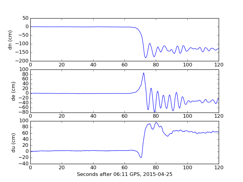
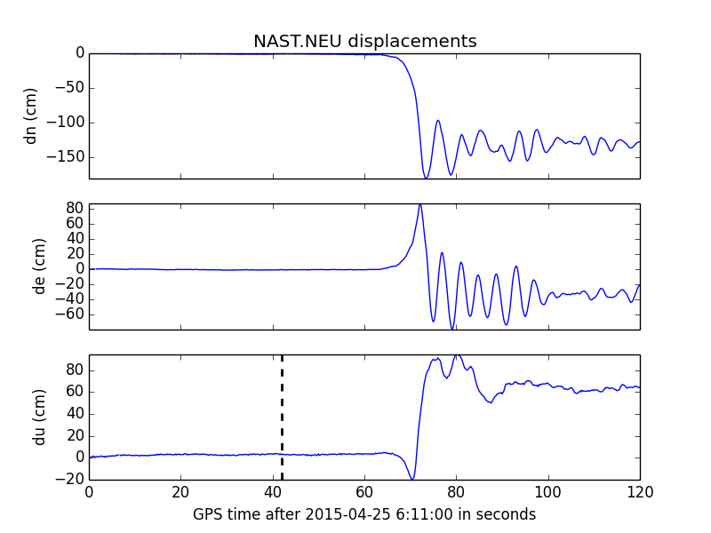
For this deliverable, download nast.neu. This file contains four columns of data: the decimal minute after 06:11:00 UTC, north, east and vertical motion in cm.
This is data from the 2015 M7.8 Gorkha earthquake in Nepal. For this exercise, turn the file contents into an array structure. There are several ways to do this.
You could use code from the last lab to turn the file into a list and then convert that into an array. Or, you could use a
numpy function to read the file directly into a multi-dimensional array. If you use the names argument to the function,
note that the documentation in '{...}' signifies options: the values can be either None, True,
a string or a sequence of strings.
Once you've turned the file into an array, you should name each column of data (or field). If you used the numpy fnction, you should use an argument
to define field names. If you reused your previous code to read the file and then created numpy arrays, you will want to use
dtype to define the fields.
Next, you should take the mean and the standard deviation of the north and east displacements. This will be useful for later exercises where you will use
the mean and standard deviation in various plots. Here's some example code (here, I have labelled the north and east displacement fields as 'n' and 'e', respectively):
print np.mean(testarray['n'])

print np.mean(testarray['e'])

print np.std(testarray['n'])

print np.std(testarray['e'])
If the output that you get from this code is not numeric, you should look at this page
to find a different numpy function to take the mean and standard deviation.
The resulting output should be:
-10.9862333333
23.6842549699
Next, create three plots where the north, east, and vertical motion are plotted over the decimal minutes that you converted to seconds (to do this, apply an operator to the array
field containing the time). Each subplot should have the y-axis labeled using plt.ylabel. The labels should be dn (cm), de (cm) and du (cm). Your plotting code should
look something like this:
plt.subplot(3, 1, 1)
plt.plot(***, ***)
plt.ylabel(***)
plt.subplot(3, 1, 2)
plt.plot(***, ***)
plt.ylabel(***)
plt.subplot(3, 1, 3)
plt.plot(***, ***)
plt.ylabel(***)
plt.show()
The resulting output should be:
Exercise 3 - Variations in pyplot
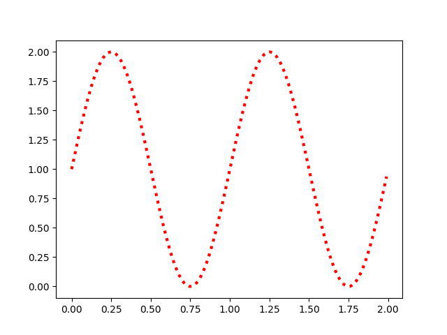
Each line plot can be changed with different attributes. The line color, width and style may be changed for example. As an example, we can modify our previous sine function plot:
t = np.arange(0.0, 2.0, 0.01)

s = 1 + np.sin(2*np.pi*t)

plt.plot(t, s, color="red", linewidth=3.0, linestyle="dotted")

plt.show()
It would produce this:
Read this documentation to learn more about how to change plot features. Then, try the following deliverable.
Deliverable 4
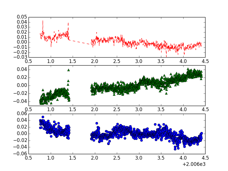
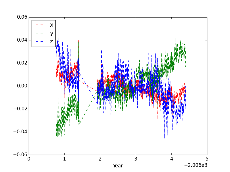
Now, let's take data from BZ09.dat file. You will be plotting x, y and z values over decimal years. First, let's try plotting the figures together instead of as subplots. After converting the data into an array, try the following code:
plt.plot(d['yr'], d['x'])

plt.plot(d['yr'], d['y'])

plt.plot(d['yr'], d['z'])

plt.show()
It should output this:
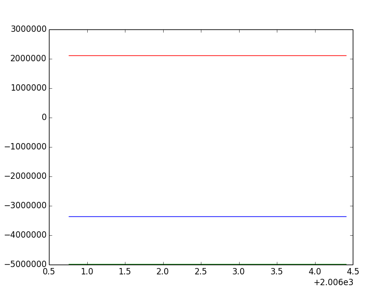
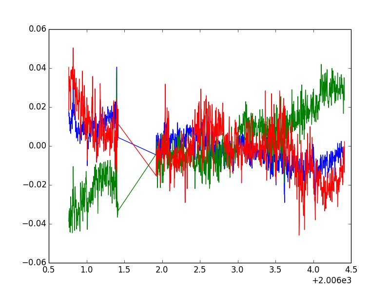
Well that doesn't look right! We can fix this by putting it into subplots (we will for Deliverable4b), but first, subtract the mean of each field from all of the values
in the field (so x = x - x.mean). This should help you for Deliverable4a.
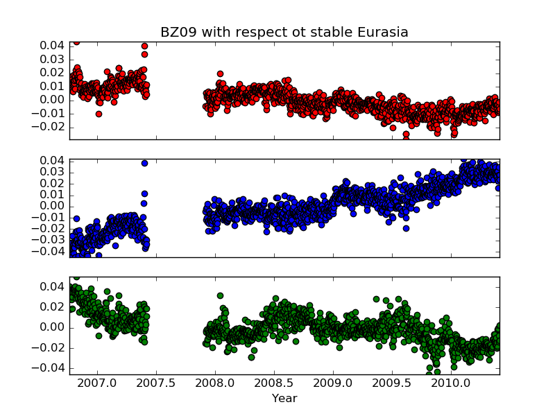
For this deliverable, submit five files: Deliverable4a.py, Deliverable4b.py, Deliverable4c.py, Deliverable4d.py and Deliverable4e.py. For each deliverable, match your plot to
the images below. Use
  from matplotlib.ticker import FormatStrFormatter
  ...
  plt.gca().xaxis.set_major_formatter(FormatStrFormatter('%4.1f'))
to ensure the correct formatting of the x-labels in plot 4d. Read up on the documentation to understand
what's going on.
For another plot, let's modify deliverable 3 to match the output below.
We use plt.gca().axis('tight') so that the scale adjusts to fit our data.
We're also going to plot the earthquake mainshock on the third plot. The time of the mainshock
is 42 seconds after 06:11 UTC. You can plot a vertical line by using the same
x-value twice and use the min and max of the 'du' data as y-values.
Exercise 3 - Other plots
Matplotlib has many other useful plots that you can use. Try this code:
import matplotlib.pyplot as plt
import numpy as np

n = 223

X = np.random.normal(0,1,n)
Y = np.random.normal(0,1,n)

plt.scatter(X,Y)
plt.show()
This example generates random x and y values and plots them in a scatter plot as points on a chart. Now try this:
import numpy as np
import matplotlib.pyplot as plt

x = np.random.randn(1000)
plt.hist(x)
plt.xlabel("Value")
plt.ylabel("Frequency")
plt.show()
This code generates an array of 1000 random numbers using np.random.randn. Then, it plots a histogram of how frequently the values show up.
Try modifying x to generate only 100 numbers or 100000 and see how it changes. You can also try making your own array and plotting that as a histogram.
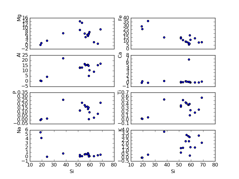
Deliverable 5
Make a Harker diagram of silica versus sodium and silica versus aluminum using this data. You will have to split the file into different lists and determine which columns of data you want for this plot. Pay special attention to the tickmark placement and axis labeling.
rgrapenthin <at> alaska <dot> edu | Last modified: March 15 2026 00:46.