Research
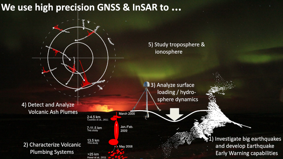
We apply geodetic tools (GNSS/GPS, InSAR, tilt) to understand volcanoes, large earthquakes, and hydrologic & cryosphere processes; sometimes we use these data to investigate processes in the troposphere or ionosphere, through which the satellite signals have to travel (signals of opportunity). For each of these broad field, we can follow these approaches:
- Analysis and modeling of observations (data) for a specific system to shed light on what process we may have captured; broadly, this helps us understand better how these systems work.
- Development of new tools (e.g., CrusDe, VMOD, SeiNei, instavels, ... ) for data analysis and modeling that are broadly transferable between various specific applications and help us gain new insights (or simply make life easier).
Read more about the topics we are working on:
Volcanology (top)
Knowledge about the plumbing system of volcanoes is important for hazard assessments and our general understanding of how they work. Surface deformation around volcanoes may show inflation or deflation, indicative of subsurface magma dynamics or hydrothermal system activity. In the simplest terms: when magma rises into a reservoir, the volcano inflates & when the magma erupts, the volcano deflates—like a balloon (Figure 1).
 Figure 1: Cycle of Volcano Deformation from unpressurized magma reservoir to overpressure and
associated inflation to eruption with lava flow and deflation (Background: Bezymianny
and Kamen with a bit of a plume from Klyuchevskoy in Kamchatka).
Figure 1: Cycle of Volcano Deformation from unpressurized magma reservoir to overpressure and
associated inflation to eruption with lava flow and deflation (Background: Bezymianny
and Kamen with a bit of a plume from Klyuchevskoy in Kamchatka).
The levels of surface deformation that we can detect are in the millimeter to centimeter range, but for large eruptions, or large magma intrusions, we can measure meter-level surface displacements.
Figure 2 below shows an example of surface deformation observed on Unimak Island with InSAR (colors, from 2015-2021) and GNSS (arrows: red is up, blue is horizontal, from 2001-2021): Inflation at Westdahl Volcano (red colors, arrows point outward and up), interpreted as magmatic recharg; and deflation at Fisher caldera (blue, arrows point down and in), which is interpreted as hydrothermal activity or cooling of the magmatic system.
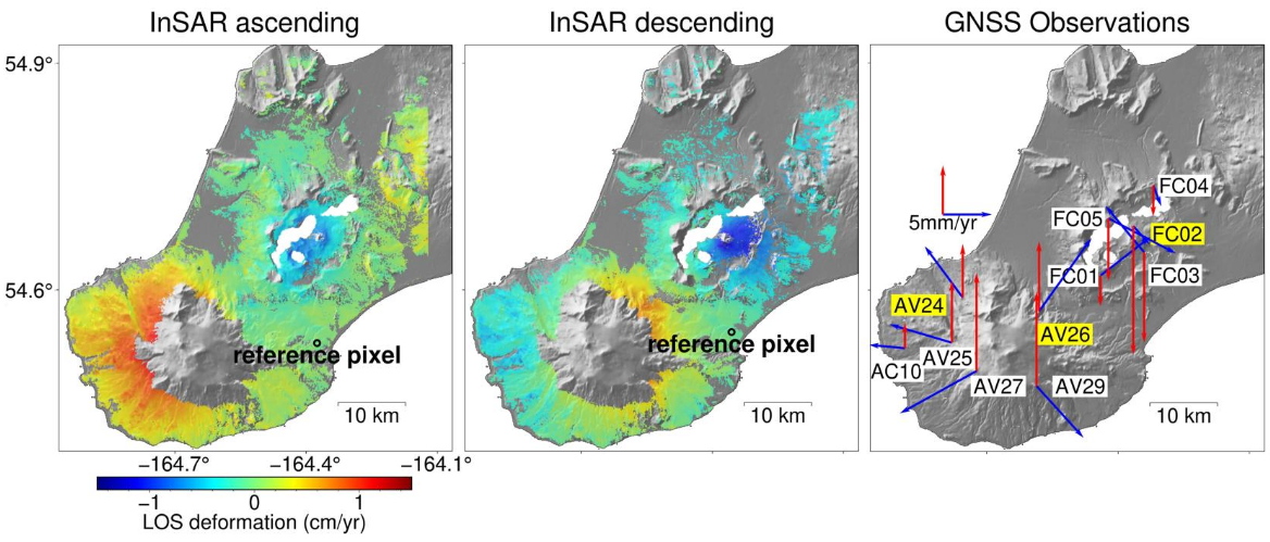 Figure 2: Interferometric Synthetic Aperture Radar (InSAR) and Global Navigation Satellite System (GNSS) observations at Westdahl Volcano (red colors) and Fisher Caldera (blue colors) on Unimak Island, Alaska.
(a) Velocity rate map for the InSAR (from 2015 to 2021) and GNSS observations (from 2001 to 2021 for Fisher
Caldera and from 2008 to 2021 for Westdahl Volcano). From Angarita et al. (2022).
Figure 2: Interferometric Synthetic Aperture Radar (InSAR) and Global Navigation Satellite System (GNSS) observations at Westdahl Volcano (red colors) and Fisher Caldera (blue colors) on Unimak Island, Alaska.
(a) Velocity rate map for the InSAR (from 2015 to 2021) and GNSS observations (from 2001 to 2021 for Fisher
Caldera and from 2008 to 2021 for Westdahl Volcano). From Angarita et al. (2022).
Once we have measured surface deformation, we can use it to constrain computer models that can tell us about where the magma is (map location and depth), the pressure or volume change, and what shape the magma reservoir(s) may be. Such analyses can then inform conceptual models of the evolution of the magmatic system during unrest. Figure 3, for instance, shows a model of magma transfer and evolution of the magmatic plumbing system below Redoubt Volcano, Alaska, through its 2009 eruption.
 Figure 3: Cartoon illustrating the evolution of the Redoubt Volcano plumbing system as suggested by geodetic,
seismic, and petrologic data. We tie deep seismicity (Power et al., 2013),
petrology (Coombs et al., 2013), and our observations together by proposing a two reservoir system
in the mid- to shallow crust. Material from 25 to 38 km migrated to about 13 km depth
beginning as early as May 2008; reheating and remobilizing residing material in a prolate
spheroid from 7 to 11.5 km. This resulted in migration to 2-4.5 km depth
(Coombs et al., 2013); supported by shallow seismic tremor beginning in January/February 2009
(Buurman et al., 2013). This material extruded from 23 March 2009 on. The mix of fresh and reheated
material from the deeper stages of the system replaced extruded material and made the shallow removal
undetectable by geodesy. From Grapenthin et al. (2013).
Figure 3: Cartoon illustrating the evolution of the Redoubt Volcano plumbing system as suggested by geodetic,
seismic, and petrologic data. We tie deep seismicity (Power et al., 2013),
petrology (Coombs et al., 2013), and our observations together by proposing a two reservoir system
in the mid- to shallow crust. Material from 25 to 38 km migrated to about 13 km depth
beginning as early as May 2008; reheating and remobilizing residing material in a prolate
spheroid from 7 to 11.5 km. This resulted in migration to 2-4.5 km depth
(Coombs et al., 2013); supported by shallow seismic tremor beginning in January/February 2009
(Buurman et al., 2013). This material extruded from 23 March 2009 on. The mix of fresh and reheated
material from the deeper stages of the system replaced extruded material and made the shallow removal
undetectable by geodesy. From Grapenthin et al. (2013).
We are working on volcanoes in many places across the globe including Alaska, Iceland, Kamchatka, and Antarctica. Most recently, we are engaging in cross-disciplinary analyses, synthesizing cross-disciplinary data sets across many volcanological disciplines to create a comprehensive understanding of the plumbing system and its evolution.
→ See our Volcanology Papers in the references.
Large Earthquake Processes & EEW (top)
Living nearby a prolific subduction zone that has produced the March 27, 1964 M9.2 Great Alaska Earthquake, and several high M7 to M8 earthquakes over the last century (see Figure 4) kindles curiosity about how such large earthquakes work, and what we can do to mitigate their impact.
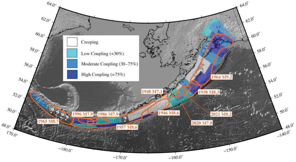 Figure 4: Coupling (colors, how stuck are the two plates?) and rupture or aftershock areas (orange outlines) of major earthquakes along the Alaska-Aleutian subduction zone. From Elliott et al. (2024).
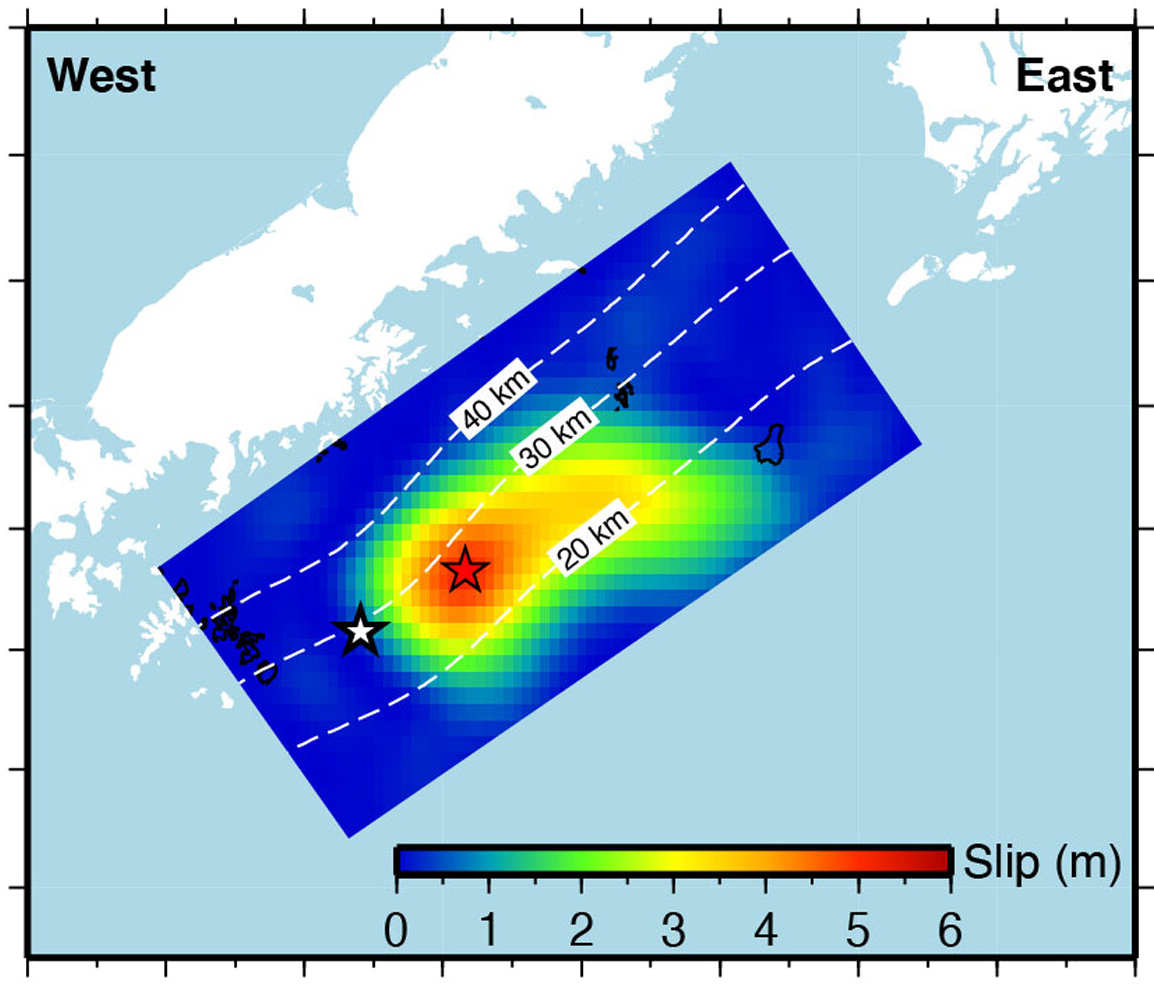
To understand such large earthquakes, we use (high-rate) GNSS and InSAR to measure the surface deformation over the seismic cycle: interseismic strain buildup due to plate convergence, co-seismic rupture, and post-seismic afterslip and relaxation. Figure 5 shows such data for the 2021 M8.2 Chignik earthquake in Alaska, where we combined high-rate GNSS (wiggly lines), static GNSS (arrows), InSAR (fringe patters), and seismic data (not shown), to figure out the location and distribution of slip on the megathrust fault that slipped during this earthquake. Figure 6 shows the slip distribution on the megathrust (but projected onto a flat surface); we found that the maximum slip was about 6 m!
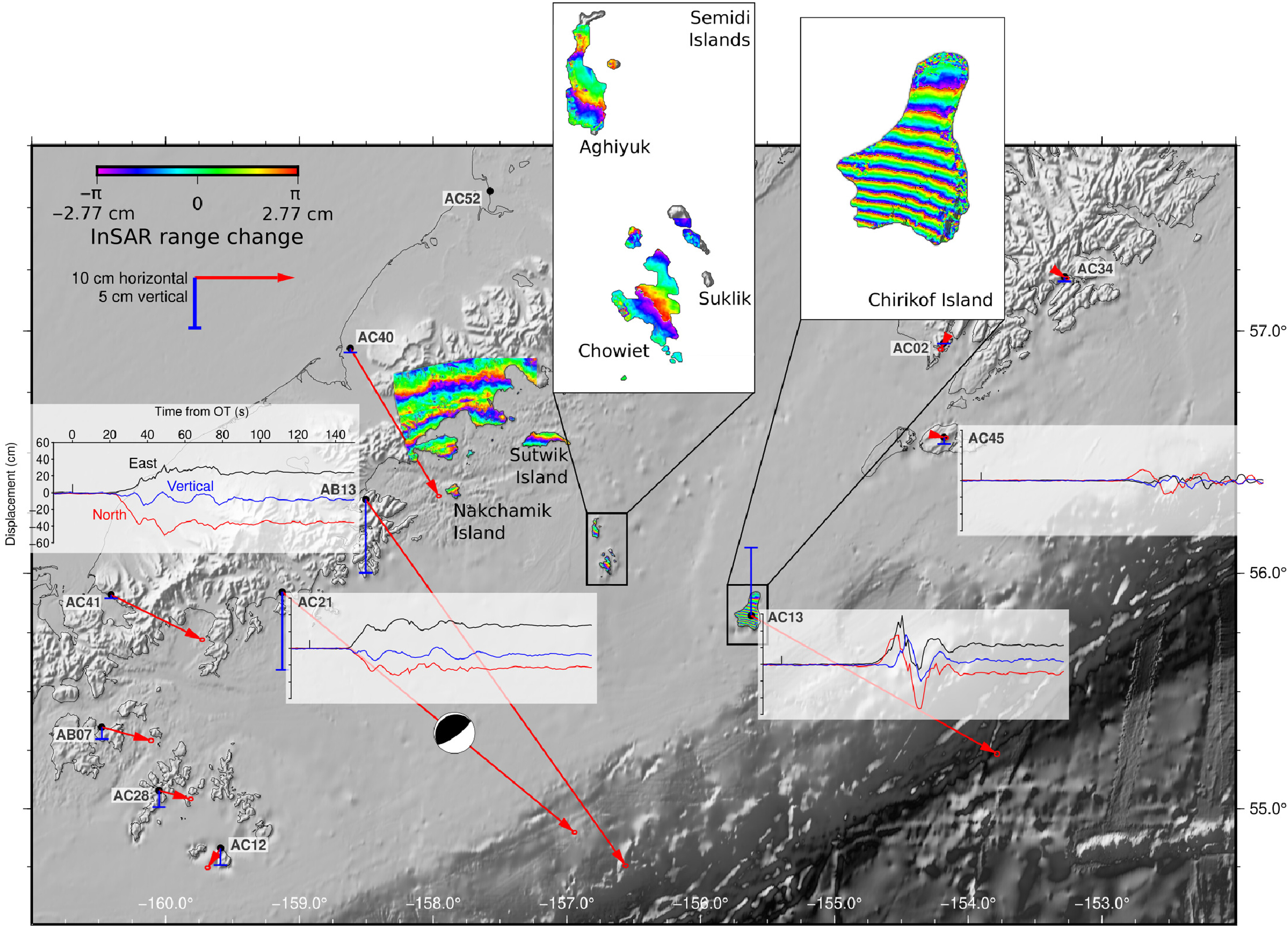 Figure 5: Overview Chignik 2021 M8.1 of near-field geodetic data.
GNSS stations are marked and show static horizontal (red) and vertical (blue) coseismic displacements. Traces of high-rate GNSS time series are plotted next to AB13, AC21, AC13, and AC45 and include east (black), north (blue), and vertical (magenta) components (see AB13 plot for component labels and time and displacement scales). Wrapped Sentinel-1 InSAR data used in the slip inversion are included with insets for Chirikof Island (path 102, frame 407, descending) and the Semidi Islands (path 7, frame 180, ascending); other areas were heavily affected by atmospheric noise. OT, origin time. From
Elliott et al. (2022).
Figure 5: Overview Chignik 2021 M8.1 of near-field geodetic data.
GNSS stations are marked and show static horizontal (red) and vertical (blue) coseismic displacements. Traces of high-rate GNSS time series are plotted next to AB13, AC21, AC13, and AC45 and include east (black), north (blue), and vertical (magenta) components (see AB13 plot for component labels and time and displacement scales). Wrapped Sentinel-1 InSAR data used in the slip inversion are included with insets for Chirikof Island (path 102, frame 407, descending) and the Semidi Islands (path 7, frame 180, ascending); other areas were heavily affected by atmospheric noise. OT, origin time. From
Elliott et al. (2022).
Figure 6: 2021 M8.2 Chignik earthquake inferred slip amplitude (colors) projected into map view with depth contours in dashed white lines.
The red star is the Chignik epicenter, and the white star is the relocated Simeonof epicenter.
From
Elliott et al. (2022)
.
→ See our Earthquake Papers in the references.
Hydology & Crustal Loading (top)
Another prominent process in Alaska that deforms the crust relates to ice and snow loading! In other places, aquifer dynamics are similarly expressive in their surface deformation activity. We can learn a lot about both the subsurface properties (e.g., elastic properties, viscosity), the load (height, weight, distribution), and acquifers (volume lost/gained) from these data, depending on how we analyze and model the system (e.g. Figure 7).

One example includes Iceland's response to annual snow load in Figure 7, where we used the observed load on Iceland's ice caps and altered the properties of the elastic crust (Young's Modulus) to fit the observed sinusiodal seasonal deformation in the continuous GNSS time series (Fig. 7b). Turns out, with a Young's Modulus of about 40 GPa, Iceland is pretty soft.

Another meaningful finding was the detection of inflation around a brine reinjection well in New Mexico (Figure 8). We found that the well casing had broken and (much of) the injection occurred at 254-265 m instead of the intended ~1500 m well depth. InSAR detection would have been possible 9 months or so before the leak was recognized and the well was shut in. Issues could have been worse had the well breach occurred ~200 m deeper, it would have been into the salt-rich Salado formation at ~470 m. This could result in larger damage because of dissolution processes.
→ See our Hydrology & Loading Papers in the references.
Real-Time and high-rate GNSS for Early Warning and Hazard Mitigation (top)
The work focusing on producing quality real-time GPS data for near instantaneous hazard assessment and mitigation is an emerging field. It benefits tremendously from high-rate (post-processed) GPS studies, as these identify worthwhile applications at a high signal to noise ratio. Major areas of research involve earthquake early warning and rapid response, eruption early warning and (near) real-time monitoring, and tsunami monitoring. The challenges in real-time applications are rather technical and engineering problems as methods need to be fast and the large noise in real-time data must be reduced.
In the early warning space, we predominantly focus on earthquake early warning development and applications. For instance, we captured the 2014 M6.0 Napa, California, in real time and produced the slip model that's shown in the Video below as the event was unfolding, that was a first. Much of our earthquake early warning developments translate well to the other fields (and becomes generally more relaxed as we end up with more time, because the processes unfold more slowly).
→ See our Seismology & EEW Papers in the references.