University of Alaska Fairbanks
Geophysical Institute
Beyond the Mouse 2010 - The geoscientist's computational chest.
Lab 6: Matlab I/O 2
Donald E. Knuth
Lab slides
none.
Exercise 1: (no solution, that's stuff you gotta do on your own)
Download these two files and store them in the same directory:
- temperature data for the last 30 years at station Fairbanks Intl Airport
- a script which creates a basic plot
Execute the script such that the figure appears on your screen. It looks a little weird with spikes; kinda like
a random fence. We'll take care of that later. For now, I want you to discover the properties of the figure/axes
you can change with the property editor: in the figure window menu go to 'edit'->'axes properties' and/or
'figure properties'. Try to find a button that says 'More Properties'; change things and see what happens.
Take note of the respective names of the properties; they are similar to what you would use as parameters.
Also try adding a title, and labels for x and y axis.
in get/set.
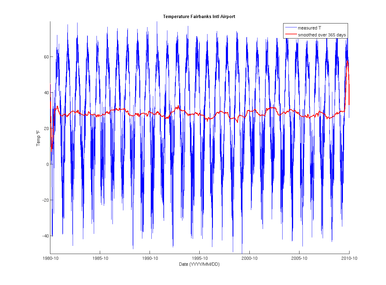
Exercise 2: (Solution (figures 1 and 2))
Now we're getting a little more serious; the data as displayed in your figure is plain wrong. We've
got to correct for this and make things look nicer. If you check line 5 in fai_temp.m you
will see that I plot temps over dates where dates is a vector
that holds the dates of temperature measurements in the format 'YYYYMMDD'. Matlab does not know
anything about you using dates for the x-axis and assumes dates contains
integer values. This is where the weird spaces in your figure come from: we have big gaps
from 19801231-19810101, 19811231-19820101, and so on. Matlab assumes those could be legal values
and reserves space on the x-axis. That's not wrong and also not too bad, but plot
by default connects all data points with a line. Hence it appears you have data where there is none.
Let's fix this! Matlab's internal representation of times is using serial date numbers.
Instead of using dates as given in the original file, let's do this:
- convert
datesfrom integer representation into strings usingnum2str - now convert the resulting string array into serial date numbers using
datenum, and the formatting string 'yyyymmdd'. Save this to a variabled_nums - Now, instead of calling
plot(dates, temps); replacedateswith the serial date numbers you just calculated. You should get a nice sinusoidal temperature series.
You might notice that the tick labels are in strange places. Let's try having them every 5th year. There are many ways of doing this. Here is one:
- We know that the first date in our time series is 1980-10-01, and the last date is 2010-10-01. Hence
we can create a cell array of the form
{'19801001' ... '20101001'}which contains the dates in 5 year intervals. - call
datenumwith the format'yyyymmdd'on this cell array and save the resulting serial date numbers to an arrayticks - Now, call
set(gca, 'XTick', ticks)to set your tickmarks on the x-axis to the dates you desired. (Well, really I do desire that, I know) - NOTE: This method assumes that the input data never changes, a better method would populate the
cell array by looking for the value at the first index of
dates, copy it into the cell array; increment it by 50000 and copy it into the cell array until it is larger than the last value of thedatesarray.
Alright. Now YOU know that your x-axis tick spacing is 5 years, but it's not really obvious in the figure. We should change the tick labels!
- call
setjust like above, but this time change the property'XTickLabel'to the result of callingdatestron the serial date number arrayticksyou create above. - Your labels should appear in the format: '01-Oct-1980' ... '01-Oct-2010'. You can change this format
by either giving one of the format numbers from 1-31 as second parameter for
datestrOR giving a freeform format similar to'yyyy-mm-dd'. Seedatestrdocumentation for details. Play with different formats and find one you like.
Great, now that we know what we're dealing with we can add title, x, and y labels. I recommend you to
use '\circF' as part of your ylabel argument to clarify that temperatures are in degrees Fahrenheit.
- In your
title,xlabel,ylabelcalls, set the 'FontSize' to 12 - In your
titlecall, also set the 'FontWeight' to 'bold'
If you want to get a better idea about how the temperature evolved over this long time, you could smooth it using a moving average approach over a period of 365 days:
- apply the
smoothfunction which is part of the Curve Fitting Toolbox totempsand give the respectivespanto 365. - I plotted the result in red with a 'LineWidth' 2 over
d_nums - Don't forget to switch
hold on - You may want to add a
legend
Your final figure should look similar to this:
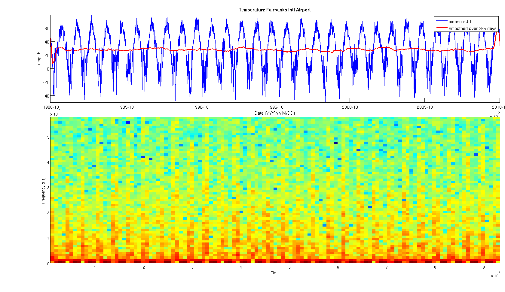
Exercise 3: Setting axes (Solution (Figure 3))
Now, with very few steps you can add a lot of extra information to that figure. Let's add a spectrogram. Here's what I want you to do:
- save the above script under a new name, say
fai_spec.m - just prior to the first
plotcommand, add anaxescall in which you set the position property to something reasonable. Make the height of the axes not larger than 30% of the figure. I positioned my axes 10% from the left border, 65% from the bottom, made it 89% wide and 30% high - the percentages a in relation to the figure dimensions. - Now go to the bottom of your script (i.e. the very end) and create another axes; keep the height below 50% of the figure. I left 10% of the figure width as space between left figure and axes edges as well as 10% of the figure height from the bottom of the figure to the bottom of the axes. Width is again 89% and height is 50%.
- Now plot the spectrogram:
spectrogram(temps, 180, 90, 128, 1/(24*60*60), 'yaxis'). Briefly explain what the parameters of this command mean. - Pretty simple, he?
Helpful Matlab Functions:
Here is a list that might be of help.
ronni <at> gi <dot> alaska <dot> edu | last changed: December 27, 2010